
Red Hat.
An enhanced dashboard experience that makes status information easily digestible in one glance.
MY ROLE
UX Design Intern
SKILLS
Interaction design
Visual design
Product thinking
TOOLS
Sketch
Marvel
Github
Background
THE TEAM
Colleen Hart
Gina Doyle
Matt Carrano
Liz Blanchard
TIMELINE
3 months
May - August 2020
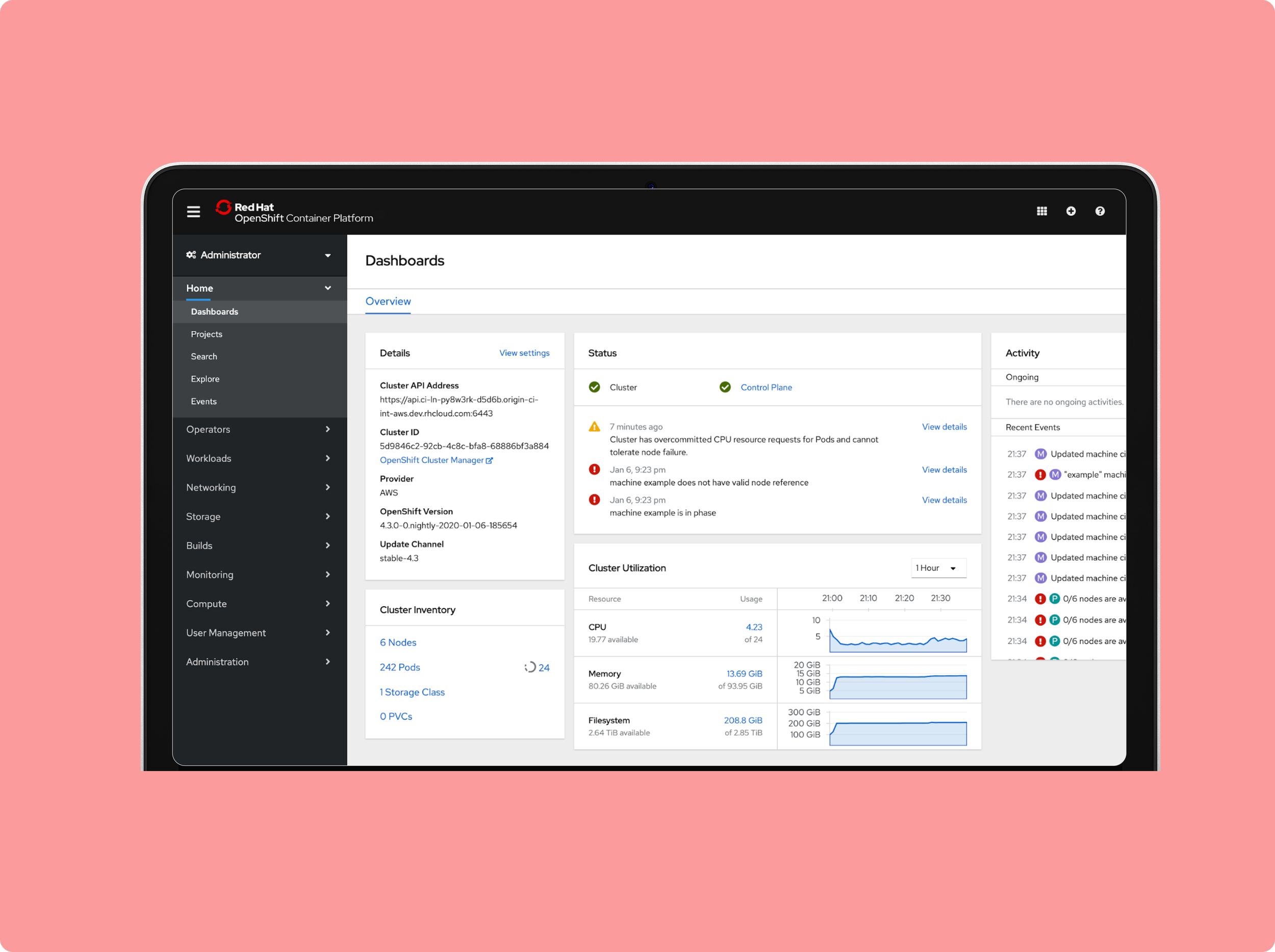
OpenShift Container Platform
I contributed to the Red Hat OpenShift Container Platform. OpenShift is platform that allows developers and IT organizations to build, deploy, and manage containerized applications. It is used by 1,000+ customers, including 50% of Fortune 100 companies.
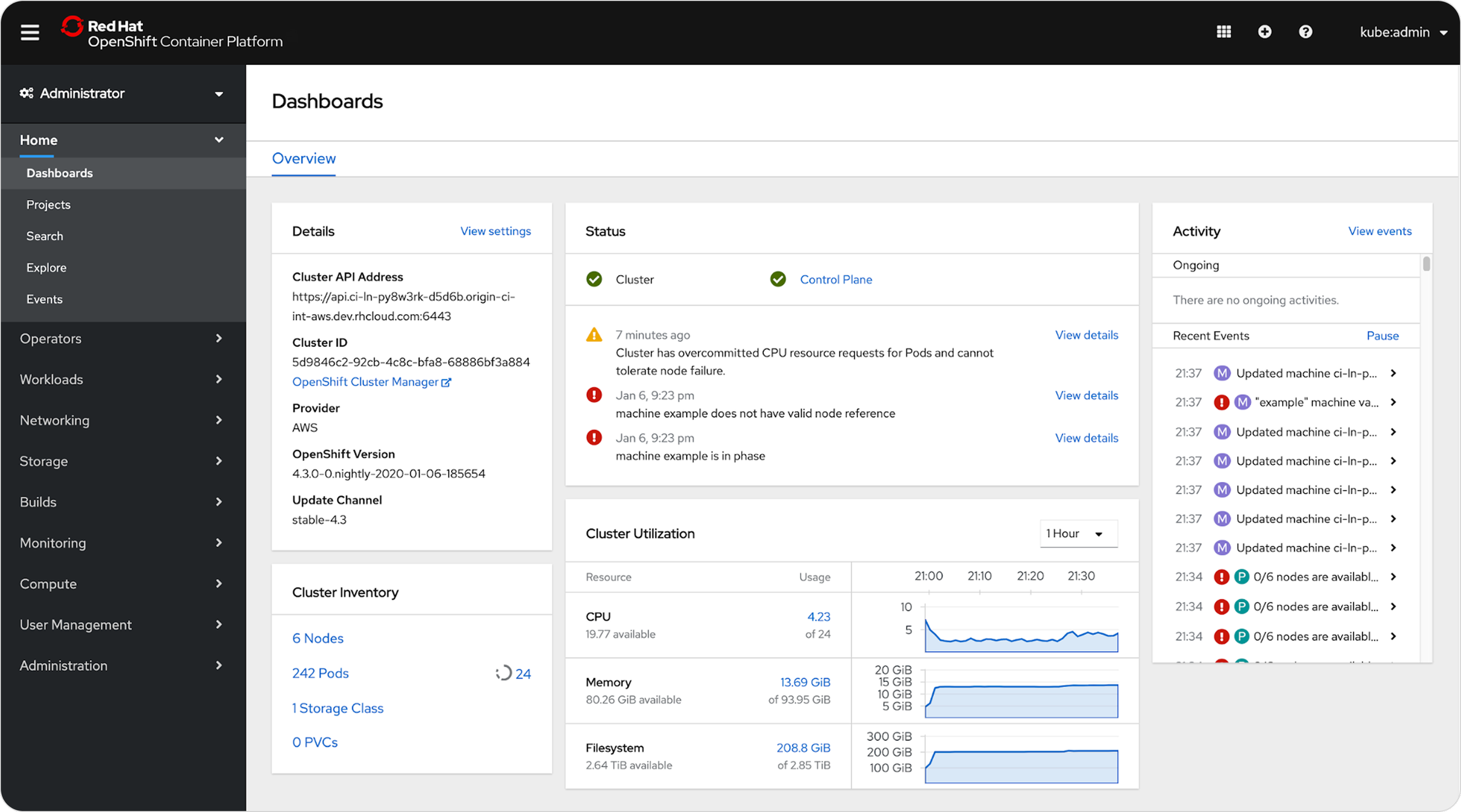
The OpenShift Container Platform dashboard for admin users shows live data on users’ applications, i.e. details, status, utilization, activity.

My project focused on the status card.
Status Card
Admins use status cards to understand the statuses of components of their applications. If the status is good, then all is well. If there’s a warning or it’s in critical condition, admins need to address it or delegate it to someone else.

Problem
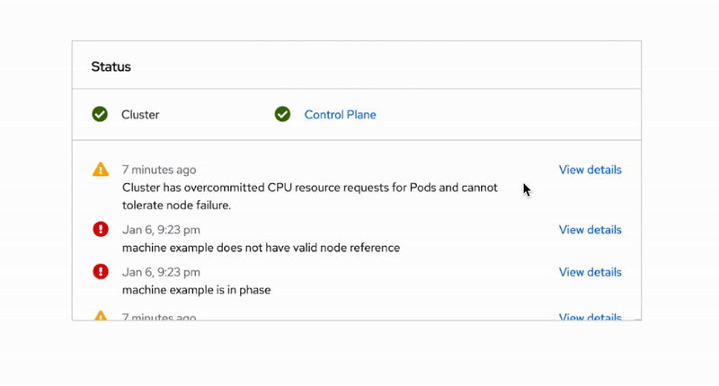
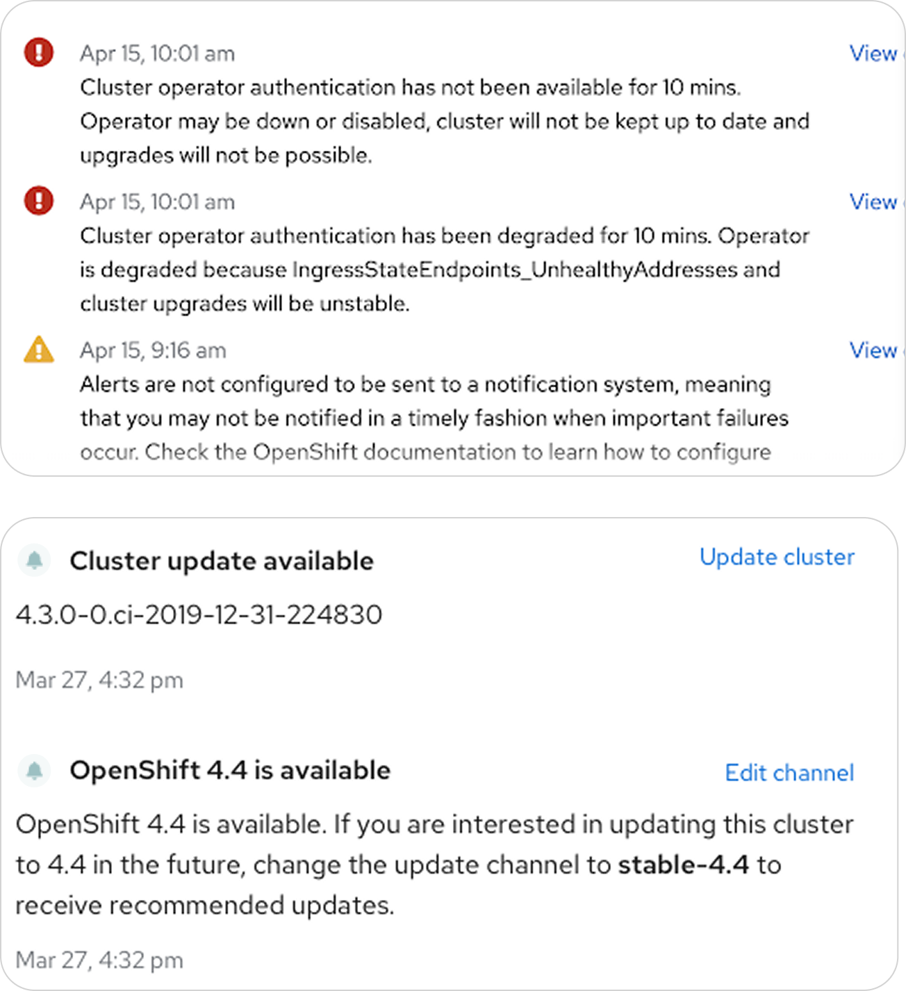
Examples of status notifications in OpenShift
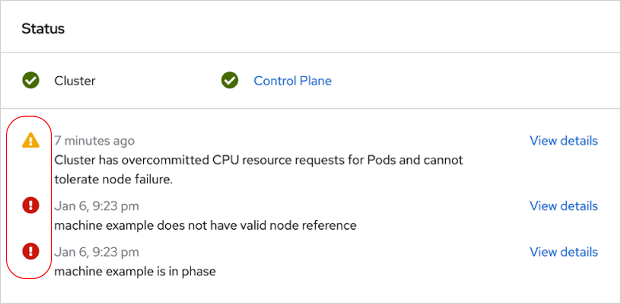
Card Analysis
I started with an analysis of the status card and asked: what is the most important information from this notification drawer that needs to be surfaced to an admin? That’s the general status for each notification which is displayed via an icon on the lefthand side.
Information Hierarchy
From this, I conducted research into the types of notifications that appear in OpenShift—critical, warning, good, information, and notification. Then I created a hierarchy of icons for which statuses are most important for admins to see.

Synthesizing all status icons

Putting It Together
I created a Notifications section for the card that surfaced these icons, effectively giving a high-level overview of the number of notifications for each status.


The notification drawer can display up to hundreds of notifications
Depending on the use case, the status card can hold several components, adding up to tens or even hundreds of notifications. This can easily lead to information overload for admins.
Creating a hierarchy of notification priority

How might we aggregate status notifications to create a compact, digestible overview for admins?
Process
Outcome
Before
PatternFly Design Kit
From our use case above, I added the aggregate status cards to the PatternFly Design Kit.

I contributed to the Aggregate status card template in the Cards section.

My spec’d status card designs
At-a-glance Overview
The enhanced card reduces information overload by replacing the notification list with labels that allow the user to quickly understand their applications’ statuses with one glance, while maintaining the ability to dig deeper and see details.
Specs
After
Design Guidelines
I wrote design guidelines on the PatternFly website on card types, usage, and views. I referenced existing design systems, such as Material Design and Carbon Design, in my research.
Design System
Conclusion

Key Takeaways
Always ask questions! There is no such thing as a bad question.
Don’t be afraid to reach out to people, even when they seem unreachable.

